Sunday, February 27, 2011

Pastel Workshop - A High Energy Day!

Pam Dunphy
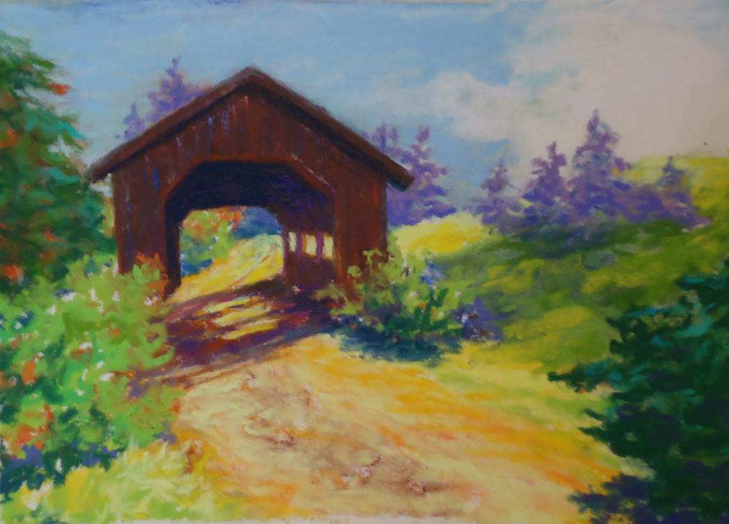
 It was a lively workshop day yesterday with 4 attendees of varied levels of experience. We experimented with a variety of papers to understand how surface affects the pastel application. Pastels come in so many degrees of softness, and we tried them all to gain understanding of which is best for a particular desired result. Underpainting techniques were also explored. We definitely packed a lot into one day and I am so thrilled with the pieces that were taken home. There was a lot of working outside one's comfort zone, essential for growth. Here is one selection from each person, top to bottom:

Helena Bosse

Pam Dunphy is a mixed-media artist, an expressive realist. This was her first experience using truly soft pastels and she exploited the medium beautifully in her bold, exciting style.

Helena Bosse's oils and watercolors are saturated with wonderful light, (helenambosse.com) and she brought that to her pastels too...also a first experience with very soft pastels.

Bob Littlefield
Bob Littlefield, with a fine hand for detail and realism focused his day on simplifying the landscape to its essentials, using large shapes of color and varied expressive marks. This piece has great depth and lovely light.
Christine Towne Swersey

Christine Towne Swersey has just recently begun to explore art making and mediums. The deliciously rich color and texture of soft pastel brought out her expressiveness. This beautifully simplified landscape exploded with color and energy.

I wish I could post everything, as it was a very exciting and productive day. Thanks to all for participating.

For info on other workshop offerings, click here.


Monday, February 21, 2011

Crazy for Glazing

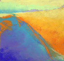
Tidal Pool  Oil on panel  24 x 24"
I've studied the work of abstract painter Emily Mason (see Midnight Oil, below) for a long time, enamoured by her brillant use of thin glazes juxtaposed with broad bold thick brush marks. She's been at it for a lifetime so I know these decisions come to her intuitively. I've been patiently experimenting hoping to come to it in my own way.

Midnight Oil  -  Emily Mason
Glazing is applying very thin layers of color over other dry (or nearly dry) thin layers. Soft flat brushes work best...sable being ideal but Richeson makes a nice line of synthetics that work fine for my needs right now.  The process results in a deep, rich luminosity. The old masters practiced glazing of course, Vermeer being the glazing king, painstakingly applying layer after layer of translucent color with fastidious intention. But I don't see it a lot in contemporary painting.

Well, I sure don't work like Vermeer, nor do I come close to Emily Mason. Still, glazing is starting to work for me and I can't get enough of it.  

Like most of the paintings I'm most pleased with, Tidal Pool (top) started much differently and slowly morphed into this composition. Rubbing out parts and glazing over with new colors, shapes started to emerge and I followed them. It started to remind me of Monhegan shores. Two more are in progress with a similar palette and I'm proceeding in the same slow and patient way, hoping for a series, but really just hoping that there will be at least two that will please me as much as Tidal Pool

Sunday, February 13, 2011

Alla Prima Oil Workshop Successes

LeeAnne Mallonee                                           

Kris Whitney                                                    
The first of my five workshops - Alla Prima Oil Painting - was such fun.  A great group of painters ranging in experience from one total newbie to oils ....to one third-time attendee to this class, and three in between, renewing oil interest and learning this wet-on-wet process. Everybody went home happy with at least two paintings, some with three. All these pieces are 6 x 6" oil on panel using walnut oil as a medium.

Gail Hipsky                                                     
From top to bottom: LeeAnne Mallonee, an abstract painter accomplished in encaustic and caran d'ache, applied her vibrant, sensuous style to the alla prima process beautifully. Kris Whitney, known for her beautiful seascapes and highly expressive abstracts, typically works in acrylic. She painted a luminous, atmospheric Monhegan.  Gail Hipsky, a pastel painter, worked in oil for the first time ever! Gail's work always has fabulous color, energy, and composition, but this is great paint handling for her first time with the medium.

Terri Sanzenbacher                                             
Terri Sanzenbacher attended this workshop for the third time. The day just wouldn't be the same without her. This still life is so delicious with her rich color and bold brush. Francine Frank used generous amounts of walnut oil medium to obtain these lush colors bleeding together in places and the unplanned, but much-loved drips. Such a lovely dreamy quality.
Francine Frank                                          


I'm so happy to be able post a sampling for each workshop attendee. It was a great way to spend a cold Maine day.


Contact info for the artists is as follows:
LeeAnne Mallonee:   inkstonestudio.net
Kris Whitney:  kristborg@aol.com
Gail Hipsky:  hipskygail76@gmail.com

Next up:  Pastel Painting, February 26 which is now full.


Tuesday, February 8, 2011

When Making a Living and Making Art Collide

Like many working artists, I have a variety of revenue streams from which I make my living. Art sales alone are not enough...yet.  In addition to teaching and conducting workshops, I do occasional graphic design projects (my livelihood before taking the leap).  The challenge for me is to be disciplined in how I carve up the time, in order to stay consistent with my studio practice and maintain my networking and marketing efforts. I've been pretty successful at doing this despite the inevitable ebb and flow of the outside work and associated deadlines. But the past few weeks have been different. A feast of graphic design has hit me, along with an unusual illustration commission (see above) and my time has been fragmented and consumed beyond control. Regular studio practice has suffered and so has my daily work on little oils (also a good source of revenue).

The image here is a portion of a 9 X 12 illustration for a new line of tortilla chips. I have also designed the new retail bags (3 varieties). This is one of three such illustrations to be done. I'm drawing from life in colored pencil in a style I haven't used in a very long time. Typically I'm striving to resist detail!

So, as I look yearningly and excitedly at all the new paintings I have underway, I need to keep reminding myself that this will pass, and the resulting cash will sustain me for several months. Then I can paint with abandon.

As insecure and unpredictable as this way of life is sometimes, I wouldn't trade it for anything else.

Sunday, February 6, 2011

While the rest of the world watches SuperBowl...

....I'm blogging! Am I un-American? Not that I have anything against the SuperBowl or watching it, in fact I think the gatherings sound fun... I just don't know anything about football, nothing at all. And, I don't have a TV. So, this is a nice quiet time for me to catch up on tasks.

My weekend was full of small tasks, one being uploading a new page to my website just for pastels. I thought it would be important to have an area designated to that medium as I've been invited to be guest artist for the Pastel Painters of Maine's Plein Air Weekend Retreat in early June.

While preparing the page, I remembered this work, "Island Hopping," which was done for an exchange my pastel class does every holiday season...a really lovely little tradition we have. So, I had to borrow it back briefly to photograph it. It's actually my most recent pastel work.

Well, on to the next item on my list.... hmmm, wonder who's winning?!

Monday, January 31, 2011

Letting go of what's precious

Late last fall I spent a day at Schoodic Point and was drawn to the cuts of ledge along the shore road (most people are drawn to the wild surf crashing against the rocks). When I got home I was eager to attack a canvas to express my experience. I had just started working with a galkyd mix medium which gives the paint an incredibly smooth fluidity. I went at it without intention of depicting reality.  I worked fast, splashing paint around and I was very excited with where this took me (top). I immediately photographed it and sent it to my dear friend, painter, and respected art historian/teacher (she looks at art all day long) for her kind but honest critique. I knew there were parts unresolved but I was so in love with some of the passages that I didn't know what to do without ruining those precious parts.  Here's what she said:   

"Wow - great start! I do agree with you that you need some further work at the botton left. I also think you need to resolve the central portion. Remember that I am just viewing a digital shadow of the actual work, but to me, there is a mushy kind of disconnect between the blue/grey foreground and what is going on in the middle and deep distance. Now if you are going for abstraction that is not an issue, and I also think even so the composition reads as top central triangle of blue/pink, slashes of yellowy green meeting in the center and more structured block like forms at the base. I think you could firm up the composition to get a stronger sense of form  no matter which way you are heading with this. As it stands now to me, everything is falling off to the left and I am just longing to get a sense of structure. Does any of this make sense to you?Maybe if you counter the dominant stretch of yellowy green running in from the left downwards with something to pull the energy back into the work?"

Hmmm. My heart sank but I knew she was right. Lack of structure in my work is the biggest criticism I get and something I always struggle with, being so involved in color. But I didn't want to touch it. I didn't want to lose the fluidity, the spontaneity.  But I've also been told by many a teacher and mentor to NOT get attached to parts of a painting and try to work around them. It never works, and I have confirmed that before. So, I let the painting sit for many weeks. I looked at it frequently but separated myself emotionally from what excited me about it. One day, I just knew what it needed and launched in as though it was a whole new painting. (bottom) There is very little of what I loved about the original left, but it is a far superior painting. And I like it more than the original stab. This is what my friend said:   "Oh! Divine, dreamy marvelous beautiful!"

Moral of the story:  don't let anything about painting become precious and untouchable.

Finished painting:  On the Rocks, 14 X 18, oil on canvas panel

Wednesday, January 19, 2011

Donating Art...Singing the Blues

It seems there is no "off-season" when it comes to getting asked to donate art for non-profit fundraisers. And while most artists I know, including myself, are active in their communities and generous with their time, it does become difficult when asked so frequently to donate pieces of art.  Here are my two main beefs:

1. Most of the time, the auctions include all kinds of stuff—from trips to heating oil. The art is beautiful and provides a lovely visual backdrop for the event, but the attendees are not primarily art buyers. If they bid on a piece they are hoping to get it for a song...partly because they aren't appreciative of the value.

2. It is expensive to frame a work and often the piece sells for less than the cost of the frame. I feel that I would be better off keeping the work to sell at full price and send a check to the nonprofit for something close to what the piece would bring.

There have been a few events in which the group splits the take with the artist  50/50 or 60/40.  That is helpful in a couple ways. It recognizes the value to the artist, and it encourages artists to donate better work. But this seems to be rare.

I am honoring my donation commitments made so far this year, but would like to outline some criteria for future commitments. Maybe it considers the level of marketing exposure offered; maybe it's purely philanthropic, driven by the cause itself; maybe it considers the quality of the event; or maybe I simply limit donations to "all art" auctions, and write a check to the others. 

I would love to hear how others handle this dilemma. Meanwhile, this is the piece I just donated to our community's Symphony Orchestra fundraiser.  "A Monet Moment,"  8 x 8" oil on panel, framed.