 |
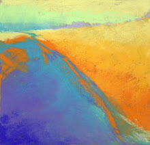
| Reflecting. 12" x 12" Pastel |
I've long used alcohol to set a first layer of pastel. It does a nice job and dries quickly and takes a new thick layer of color beautifully. Sometimes I will put lots of alcohol to turn the pastel the consistency of paint and then paint into it with a brush. But this time I turned the piece upside down and just kept spraying and spraying until the colors ran together, dripped and splattered. The paper was buckled and warped. It was soaked and took nearly an hour to dry.
Hmmm. In addition to the dripping and running of colors, the texture of the Wallis kind of lifted in places. It looks and feels very sandy, not buttery like a normal pastel. I went into it gently with soft pastel in just a few places to accent a line or a shape, but mostly this is as I found it when dry, with just a tad of cropping.
I love abstractions but keep flip-flopping about whether this is anything beyond just interesting. Comments are welcome.


As beautiful as this painting is...it is more beautiful in person!
ReplyDeleteLove the composition and the effect of the alcohol is really nice. This piece is compelling.
I like it very much...as it is. Question: how do you repair the buckling of the paper...hard to paint back onto. Leave it, frame it, more than interesting.
ReplyDeleteSurprisingly, Cindy, the Wallis paper just calmed back down after it dried. It was easy to paint back into it. The edges are still a little curled but a day stored flat under weight and it should be fine. Wallis is amazing stuff! And thanks for your "go" vote on this one!
ReplyDeleteLinda, This painting is so great. I love the effect of the dripping alcohol and the fact that it is a reflection. This painting is even better in person. Wonderful.
ReplyDeleteThanks, Sue. I agree that it looks better in person because the textural qualities don't show up that well in the photo. I keep feeling that something is missing but maybe it's because it was just too easy!
ReplyDelete